Chromostereopsis in User Experience Design
Use color contrast to produce great 3D effects and avoid unwanted ones
by Elizabeth Buie (copyright notice)
July 2011
You may have noticed some websites that use color in ways that make your eyes hurt or create weird 3D effects. You may have seen some presentations that emphasize some words or phrases in ways that make the differently colored words actually less prominent, as if they were fading into the background. These effects are probably due to a phenomenon called chromostereopsis.
What is chromostereopsis?
Sit back from your computer a ways, and look at the two words in the box below. Which one appears closer to you? Pay no attention to which one is more visible or easier to read — does one seem to float in front of the screen while the other sinks back into it?
Blue
If you're like most people (including me), the red text looks closer to you and the blue looks farther away.
(A minority — although not a tiny one — see blue as closer than red, and a very small number of people don't experience this effect at all.)
This is chromostereopsis. Wikipedia defines the term as "a visual illusion whereby the impression of depth is perceived in two-dimensional color images", and the American National Standard ANSI/HFES-200, Part 5 defines it as "the perception of depth resulting from the close proximity of two colors of disparate wavelengths". (You may read other descriptions that characterize it as an intentional attempt to make the viewer's eyes hurt, but pay no attention to them.)
This illusion allows us to use color to create depth in our visual designs.
It also requires us to ensure that when we use it, we do so intentionally and not accidentally.
In this article I'll show how it can be used to good effect, give some examples of unfortunate (but certainly unintentional) use, and share some tips and tricks for avoiding the negative effects of unintended use.
How it works
Chromostereopsis is a function of how a lens refracts light of different wavelengths.
How we used to think it works
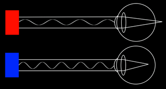
Figure 1. Old model:
Light of different wavelengths
is focused differently by the eye.
(larger image)
When I first learned about chromostereopsis, in the early 1990s, it was thought that the effect was due to the different way the eye focused different wavelengths. Red (average wavelength about 650 nanometers) was thought to focus further back in the eye and blue (average ~475nm) further front, making it impossible for the eye to have objects of pure red and pure blue in focus at the same time. This made pure red objects appear to be closer to the viewer than pure blue ones. Figure 1 shows how this was thought to work. (See this SIGGRAPH piece for a 1984 article on this.)
Then we noticed that some people perceive blue as being closer than red. We noticed that the effect is stronger when you are farther from the object (or from the screen). And we noticed that the effect is absent when you are using only one eye.
In fact, it was only while I was researching the topic for this article that I learned that things had changed. A previous article on this site, HCI Standards: A Mixed Blessing (published in ACM's <interactions> magazine in 1999) described it in this way. When I wrote that article, I had not realized that things were already changing.
What we know now
More recent studies have determined that all wavelengths of light are focused on the retina, the difference being that the shorter wavelengths are focused more toward the nose while the longer ones are focused more toward the ear. This mimics ordinary depth perception, in which closer objects are focused more toward the ear and farther ones more toward the nose. (This doesn't explain, however, why some people perceive blue as more distant than red.)
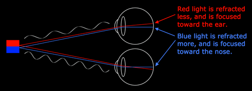
Figure 2. Current model:
Light of different wavelengths
is refracted differently by the eye.
(larger image)
Figure 2, at left, shows the current model of how this works. (Note that in Figure 2, I have adjusted the color of the blue lines and the blue text, to make them more visible/legible. They are not the pure blue of the rectangle from which the light comes.)
Other interesting tidbits
The effect is stronger when the colors are close to each other, and can seem overpowering when they are adjacent.
The effect is much weaker when the contrasting colors are displayed on a white or other light background of low saturation, particularly when the background's hue is different from that of either of the contrasting colors (unless of course the saturation is zero, in which case the hue can be anything at all :).
Even people with color blindness are susceptible! Chromostereopsis happens because of how the lens refracts different wavelengths of light, and color blindness is an artifact of the way the retina senses different wavelengths and sends color signals to the brain. These are two entirely different things!
Do try this at home!
You can strengthen the effect that you see. Take two index cards and punch a pinhole in each one. Hold the cards in front of your eyes and look through the pinholes at the red and blue words in the box at the top of the page.
You can change which color appears closer to you. Cover the outer side of both of your eyes (not the very center), and look at the red and blue words. Then cover the inner side and do it again. Which one is closer?
You can make the effect disappear altogether. Close or cover one eye.
See some interesting examples:
- http://www.ritsumei.ac.jp/~akitaoka/scolor-e.html

- http://www.psy.ritsumei.ac.jp/~akitaoka/scolor2e.html

How to use chromostereopsis
Is chromostereopsis always bad? No, definitely not. Sometimes you want to make some elements jump forward and other elements recede. Here are a few examples of presentations that use it well. (Although all of the "good" examples so far are of presentations, the reasons they are good apply just as well to websites and software interfaces.)
First, let's look at two slides from Leisa Reichelt's presentation "Improving your site's usability – what users really want" ![]()


In each of these slides the magenta words jump out from the background, emphasizing the most important aspect of the content. Bold words embedded in the rest of the text set the context but don't compete with the magenta, which is where the viewer's attention needs to be drawn. The white background mutes the effect somewhat. All in all, this is a very subtle and extremely effective use of chromostereopsis.
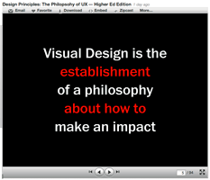
The next example is from Whitney Hess's presentation "Design Principles: The Philosophy of UX – Higher Ed Edition" ![]()

This use of chromostereopsis is very different from Reichelt's because the colors appear on a black background, which strengthens the 3D illusion produced by the red text.
White stands out in its own way, and the use of white for the main point of this slide is just right. In this case it doesn't matter whether the red jumps out or recedes for any individual viewer — this color scheme works for this content because the red calls attention to itself in a different way from the white and is used for a different purpose.
Here too, the use of chromostereopsis is very effective. It may not be as subtle as Reichelt's, but that's perfectly fine — it's extremely well suited to the content of the slide.
Basically, this use of chromostereopsis works so well because although two colors are prominent, they have different purposes and so they do not compete for attention in the same context.
The third example is from Stephen Anderson's presentation "Creating Pleasurable Interfaces: Getting from Tasks to Experiences" ![]()

Here we have a bright red oval used to highlight a part of the slide. The red jumps out from the cyan background, and for many people the 3D effect will be strong. However, it is far enough from the text that it doesn't compete for attention — in fact, it guides the viewer's eye to the important text.
Anderson has used chromostereopsis to good effect in this slide.
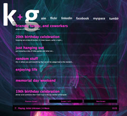
The last example is from a website that has chromostereopsis on top of chromostereopsis. The designer, Kenroy George, shows this design as part of his portfolio ![]() (evidently this image is a screenshot of an older version of his own website; scroll down to near the bottom to see the large version of this particular image).
(evidently this image is a screenshot of an older version of his own website; scroll down to near the bottom to see the large version of this particular image).
The magenta headings really pop out and the white detailed lines recede. In the background, the magenta/cyan/blue combination creates its own 3D effect. We can argue about how legible some of the text is against this background, but I find this design to be very beautiful.
A final note: Notice how calling attention to certain words or other visual components sometimes benefits from a 3D effect and sometimes doesn't need one.
Watch out!
Making certain words or other visual elements seem to pop out of the page is more involved than just emphasizing them. We can use color for emphasis without creating 3D effects, and sometimes that's exactly what we want.
In this section I will show some (certainly unintentional) misuses of chromostereopsis and explain what the problems are.
The first example of unfortunate chromostereopsis is from the same Whitney Hess presentation ![]() as the above example of her outstanding use of it.
as the above example of her outstanding use of it.

In these two slides the brightness of the white text and the depth effect of the red text compete for the viewer's attention. The 3D words are part of the main flow (I can't figure out how this choice of word coloring could be intended to emphasize concepts), and the reader can't restrict attention to either color and still read something that makes sense.
The problem is that it’s not clear what’s most important in these two slides, and the 3D effect makes it difficult for the viewer to read them smoothly.
These slides require the viewer to think about how to read them.

The second example is the Mini automobile manufacturer's Awards page ![]() . The main head ("Awards.") is a very pleasant blue with just a little green in it (hue 199). The problem is that it sinks into the black background, turning the subhead ("picking up gongs all over" — what does that mean? must be a Britishism, I guess... :) into what is by far the most prominent thing on the page. Now, maybe the designer intended this... but if I may say so (and surely I may, as this is my website), I certainly hope not.
. The main head ("Awards.") is a very pleasant blue with just a little green in it (hue 199). The problem is that it sinks into the black background, turning the subhead ("picking up gongs all over" — what does that mean? must be a Britishism, I guess... :) into what is by far the most prominent thing on the page. Now, maybe the designer intended this... but if I may say so (and surely I may, as this is my website), I certainly hope not.
The third example is from Vinay Mohanty's presentation "Are You An [sic] User Experience Designer?" ![]()

The red text starts off hard to read against the dark gray, and proceeds to become almost totally illegible against the medium gray. (Even at full Slideshare size ![]() the bottom one is barely legible.)
the bottom one is barely legible.)
Houston, we have a problem!
This, my friends, is why UX designers need to be educated not only about chromostereopsis but about color contrast in general.
Let me put in a plug here for Jonathan Snook's Colour Contrast Check ![]() . It could be a little more flexible (I'd like to enter HSB numeric values, for example), but it's INVALUABLE for determining how well a text/background color meets W3C contrast guidelines for legibility.
. It could be a little more flexible (I'd like to enter HSB numeric values, for example), but it's INVALUABLE for determining how well a text/background color meets W3C contrast guidelines for legibility.
And now, just for fun, and in the "Oh, the irony!" department...
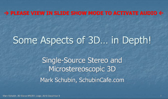
Here's a gem from Mark Schubin's presentation "Some Aspects of 3D... in Depth!" ![]()
The red, all-caps text that shows here ( -> PLEASE VIEW IN SLIDE SHOW MODE TO ACTIVATE AUDIO <- ) is probably not part of the slide itself but is, I would guess, added by the slideshow app to help people viewing it on the Web. However, I find it impossible to imagine that when Mr. Schubin chose the blue background he was unaware that red text would be displayed atop it on the website.
Want to know the funniest part? This presentation actually mentions chromostereopsis!
Tips and tricks: The three "S"s
Pretty much all the sites you see that mention chromostereopsis in UX design say nothing more than "don't display red and blue or red and green together." Some say "don't display red on gray." But I have found none that give specific advice on what to do instead — and I've done a LOT of searching on "chromostereopsis" in the last week! So I've done it myself.
Here are three tips for how to reduce unintended chromostereopsis in visual design. I call these the three "S"s — saturation, separation, and surroundings.
Saturation
Use colors that are less saturated, containing some each of red, green, and blue. Adjusting the hue a little can also help, if it gets you away from the pure tone.
Figure 4 shows examples of adjustments to the primary colors. This greatly reduces the 3D effect and also gives them very close apparent brightness. (Note: A brightness value of 100% in the HSB model does not guarantee a consistent level of apparent brightness as seen by the eye!)

Figure 4. Reducing the saturation
greatly reduces the 3D effect of chromostereopsis.
Sometimes adjusting the hue/brightness is also helpful.
(larger image)
The effect is still there a bit, but is not nearly as strong.
I have made a similar change to the Mini Automobiles Awards page that I mentioned earlier.

I tweaked the blue to reduce the saturation (from 95 to 72) and increase the brightness (from 69 to 81) while keeping the hue constant, and it is much more prominent than it was. To my eye, it also recedes a bit less.
And finally, let's look at a design that does this naturally:
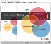
This image is from Fjord's presentation "Fjord@ The Future of Broadcasting" ![]() . It uses red and blue, but there is no chromostereopsis involved because the saturation of each of these colors is so low. (This is also affected by the white background; see the "Surroundings" tip, below.
. It uses red and blue, but there is no chromostereopsis involved because the saturation of each of these colors is so low. (This is also affected by the white background; see the "Surroundings" tip, below.
Separation
Separate the contrasting colors. Whether you separate them spatially or semantically, you will prevent viewers from having to pay attention to items of both colors at the same time. Some amount of spatial separation is necessary because of the sensory fact of chromostereopsis, but objects of contrasting color that are separated semantically can be closer in space without causing problems.
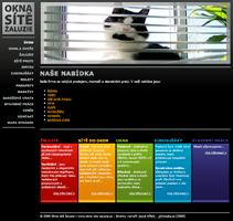
Let's look at a brilliant and beautiful example.
The Czech site Okna Site Zaluszie ![]() (sorry I can't do the Czech diacriticals) has a band of bright colors at the bottom of its home page. These include not only red and blue but also green and violet. However, the band of red is separated from the others by a band of orange-ish yellow. This not only produces a substantial physical separation of the red from the others, it also provides a color of intermediate wavelength to help moderate the effect. To these designers I say, bravi!
(sorry I can't do the Czech diacriticals) has a band of bright colors at the bottom of its home page. These include not only red and blue but also green and violet. However, the band of red is separated from the others by a band of orange-ish yellow. This not only produces a substantial physical separation of the red from the others, it also provides a color of intermediate wavelength to help moderate the effect. To these designers I say, bravi!
And one more comment on Whitney Hess's presentation: Semantic separation is the reason why the one slide is brilliant and the other two are not.
Surroundings
And finally, you can surround the contrasting colors with a background that moderates the effect of their different wavelengths. Your best choices are white, very light gray, or a color of very low saturation, high brightness, and a different hue from either of the contrasting colors.
I'll let you try these out and see how they work. :)
Comments
I'd love to hear your thoughts on this article and your experiences with chromostereopsis. I've created a blog post for that purpose. See you there!
References and further reading
Here are some links to information I used for this article. They provide some interesting reading! (Each of them will open in a new window.)
- Neural correlates of chromostereopsis: An evoked potential study (ScienceDirect)
- Seeing depth in colour: More than just what meets the eyes (ScienceDirect)
- Binocular Vision and Stereopsis, by Ian P. Howard and Brian J. Rogers (Oxford Psychology Series) (Google Books link)
- Definition of chromostereopsis in the Medical Dictionary
- Lecture 15 Stereoscopic Phenomena, Stereograms (PDF)
- Physiological Principles for the Effective Use of Color (1984 article on how we used to think that chromostereopsis worked)
Copyright © 2011, Elizabeth A. Buie. All rights reserved.
