30 March 2015

Calibrating web design for citizens: The value of user testing for government websites

(This is the English version of an article I wrote for Nòva24Ore Tec, a technology insert edited by Italian journalist Luca De Biase for the newspaper Il Sole 24 Ore. Note: The Italian version has been edited down a little.)

Montecitorio, the House of Deputies

Italy leads the world in Design. Italian designers create elegant, beautiful products that people everywhere love. “Quite simply, we are the best”, declared architect Luigi Caccia Dominioni. “We have more imagination, more culture, and we are better mediators between the past and the future.” So why should Italian website designers imagine that they should test their designs with users?

Italian websites can be beautiful and elegant indeed. But for people to love a it, a site must be usable as well. It must enable its users to accomplish their goals quickly, smoothly and accurately. Especially when it’s a public administration site whose job is to serve all of the citizens (and many foreigners too).

Government digital services involve complex interactions with the people who use them. Even the best designers cannot predict with certainty how well users will understand and respond to a design, what they will find confusing or frustrating in even the simplest transaction. Yes, there are guidelines for usable web design, such as the US Government’s research-based guidelines. But even these extensive, detailed guidelines acknowledge usability testing as an essential part of the process.

Providing government services via digital channels has two goals. The obvious one is to save money: the UK’s 2012 Digital Efficiency Report describes the digital channel as much cheaper than the others. For some services, it says, transactions conducted by telephone, by post, and in person cost 20, 30, and 50 times as much, respectively, as transactions conducted digitally. No wonder governments want to get citizens online. According to its 2013 Government Digital Strategy paper, moving to “digital by default” would save the UK government £1.7 to £1.8 billion each year.

That’s approximately 2.4 billion euros in savings every year. With almost as many people as the UK, might not Italy hope to achieve comparable savings?

Less obviously, perhaps, but equally importantly, going digital aims to improve the availability and efficiency of government services. Here’s the UK Government Digital Strategy paper again:

“But this isn’t just about saving money – the public increasingly expects to access services quickly and conveniently, at times and in ways that suit them. We will not leave anyone behind but we will use digital technology to drive better services and lower costs.”

Cost savings, however, cannot be achieved merely by providing services online. If the services are not usable enough, the public will not use them. The October 2013 launch of healthcare.gov, the site by which Americans were to sign up for the new health insurance program, failed disastrously. It failed in part because of usability problems that testing could have found, such as requiring users to create an account before they could find the cost of an insurance policy. In large numbers, Americans had to use the much costlier telephone and in-person channels to access this service, and the site had to undergo expensive revision.

The UK Government approaches usability by requiring its public websites to adopt not only a consistent style but also a user centered process. The Digital by Default Service Standard requires all new transactional government services to meet 26 criteria for digital service provision. The criteria cover goals (“Create a service that is simple and intuitive enough that users succeed first time, unaided”), methods (“Establish performance benchmarks … against which the service will be measured”; “Analyse the prototype service’s success, and translate user feedback into features and tasks for the next phase of development”), management (“Put in place a sustainable multidisciplinary team that can design, build and operate the service, led by a suitably skilled and senior service manager with decision-making responsibility”). The standard explicitly requires user research and usability testing (“Put a plan in place for ongoing user research and usability testing to continuously seek feedback from users”) as part of the process, and it addresses both user performance and user satisfaction.

The USA takes a different approach. Its General Services Administration (GSA) offers a DigitalGov UX program that provides training and support to help agencies develop and apply their own usability competencies. “We provide effective user-centered services”, GSA says, “focused on the interaction between government and the public it serves.”

Usability engineering costs money, you might argue. And you’d be right. Thirty years ago, people argued against software engineering because it was “too expensive”. Eventually we learned that software engineering saves more money than it costs: the earlier a problem is found, the cheaper it is to correct — and a re-do of a fielded system is expensive. The same goes for usability: a prototype is far cheaper to change than is a site that has already gone live. In addition, launching a site that still has major usability problems can give you a bad reputation and can make people reluctant to come back to it, even after you fix the problems. Especially in these days of social media, word spreads fast.

posted by Elizabeth at 04:03 Leave a comment

17 August 2013

“Usability in Govt Sys” book review from Society for Technical Communication

The Society for Technical Communication has published a review of my book.

The June 2013 issue of Technical Communication Online, STC’s Journal, contains a review of Usability in Government Systems: User Experience Design for Citizens and Public Servants, the book from Morgan Kaufmann Press that Dianne Murray and I edited. The review, written by STC former book review editor Avon J. Murphy, begins as follows:

Elizabeth Buie and Dianne Murray have pulled together a book that is long overdue. Government computer systems affect everyone, but until now, no book has focused on improving the user interaction with those systems.

The editors do most things right. Their collection of 24 chapters by 41 authors spread over nearly every part of the globe provides an international kaleidoscope rich in detail.

Murphy likes the international flavor and rich detail of the book and applauds the inclusion of case studies, success factors, and further reading. He finds eight chapters “particularly useful and interesting” for himself, and he calls particular attention to chapters he sees as strongly relevant to technical communication. Murphy points out three chapters whose authors will be familiar to STC members — plain language, content strategy, and usability testing — and I was pleased to see his description of my own chapter, “Getting UX into the Contract” (coauthored with Timo Jokela), as a don’t-miss for people who work with contracts. Murphy recommends that usability folks working with government systems buy the book and that technical communicators borrow it to read specific chapters.

Murphy also expresses three criticisms. To two of them I say “fair enough”:

  1. Some chapters, Murphy says, “are dull reading, with too many long, often boring paragraphs.”
    Honestly, I wish we had had more time to edit the writing of our chapter authors who are better subject-matter experts than they are writers in English. I like to think we will have the opportunity to improve those chapters in future editions of the book.
  2. The second concern, he describes as “an interesting usability weakness”. (Ouch!) “Neither the detailed table of contents”, he writes, “nor the biographical section identifies who wrote which chapter.” This, he says, makes the book harder to navigate.
    This is a good point, and I suspect it will be easy to add chapter authors to the ToC in future editions.

Murphy’s third criticism, however, does not hold water. Some of the chapters, he writes (citing specifically the ones on security, privacy, and policymaking), “seem not to apply directly to usability at all.” This comment appears to miss the fact that this book addresses not only usability but the broader concept of user experience, and that it covers not only immediate interaction with electronic systems but also the contexts in which those interactions occur. Moreover, electronic system usability directly affects citizen security and privacy: The usability of online security, for example, has received much attention from usability experts such as Dana Chisnell and from business publications as important as Forbes. This book is about applying usability engineering to all aspects of system design that affect citizens’ experiences of interacting with government.

Right, enough grousing. On the whole, I’m very happy with this review. It is overall quite positive, it gives some specific feedback that Dianne and I can address in future editions, and it encourages people to buy the book. I could hardly ask for more.

posted by Elizabeth at 08:08 Tagged , | 2 Comments

14 May 2012

New SIGCHI Community: Research-Practice Interaction

A small group of people, mostly participants in this past week’s annual “CHI” (Computer-Human Interaction) conference, have formed a community to promote the exchange of information between research and practice in the fields involved with making computer systems and web sites better suited for use by the people who use them. This community exists under the auspices of the Association for Computing Machinery’s (ACM’s) Special Interest Group on Computer-Human Interaction (SIGCHI), and we call it Research-Practice Interaction. Our mission is as follows:

The Research-Practice Interaction community is a bridge between research and practice in HCI, including all flavors thereof (user experience, usability, interaction design, information architecture, etc.etc.). We aim to promote the exchange of information between researchers and practitioners, such that research and its results are more accessible to practitioners and that practitioner information needs are conveyed to researchers.

This community arises from the work that several of us have been doing in this area over the last few years, in SIGCHI and elsewhere. We are concerned when we hear practitioners say that the CHI conference is not relevant to them, when we know that it offers rich opportunities for cross-fertilization and has much content that would clearly be relevant if it were easier to digest. We are concerned when we read research papers that use valid research methods but unrealistic examples or situations, when we know that using realistic examples would make them more relevant to practice and more solid as useful research.

At CHI2010 we held a workshop on this topic (see the recap). (Similar workshops were held at the 2010 Information Architecture Summit and the 2011 conference of the Usability Professionals Association.) We concluded that the research and practice communities are what they are, for reasons that support their internal needs; and rather than beating our heads against the walls trying to change them, we who have (or want to have) some understanding of both communities need to build bridges and information conduits between them.

Hence the SIGCHI Research-Practice Interaction Community.

ACM members can join the community as a full member. Nonmembers can sign up for a free acm.org account and join the community as an affiliate, to receive updates and information.

If you care about the flow of information between research and practice in the field of interaction between people and technology, join us in helping make it better!

posted by Elizabeth at 07:05 1 Comment

11 May 2012

We Are All Stakeholders

Can you think of anyone whose life is not affected by government information and communications technology? Anyone at all?

Even in the farthest reaches of the remotest areas, even when a population is completely isolated from the outside world, people’s lives are affected by the policies and procedures of the government that administers the area in which they live, and no doubt those of some other governments as well. And virtually all* governments carry out their procedures with the support of information and communications technologies (ICTs).

The usability of government systems affects us all. All 6.8 billion of us.

Usability is the effectiveness, efficiency, and satisfaction that a system or product provides to the people who use it. Even if we never use any government systems ourselves — even if we never visit a government website to pay a parking ticket or obtain retirement/pension information — we feel the effects of the usability of the systems that our governments at all levels use to conduct their business. Effectiveness and efficiency (two sides of the usability triangle) are major factors in the productivity of both civil servants and military personnel. Satisfaction (the other side of the triangle) is more important for encouraging citizens to use online methods to interact and communicate with government, but it also plays a role in fostering morale and therefore productivity of government employees. If you like your job, you are likely to be better at it.

Some may say that politics enters into the question of government system usability; I say it does not. We may disagree about what we want government to do, but I think we can all agree that we want it to be more cost effective.

In the usability of government systems, we are all stakeholders.


* Do you know of a government that doesn’t use ICT at all? Please let me know! If you could do this via a comment to this post, that would be even more awesome, and greatly appreciated.

posted by Elizabeth at 02:05 Leave a comment

2 December 2011

Usability in Government Systems — A Forthcoming Book

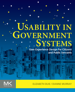
Just before US Thanksgiving of 2011, my co-editor and I delivered to our publisher the manuscript of a new book on usability in government systems. Two and a half years after Dianne Murray suggested doing a book and we chose the topic — and six weeks after I began the most intensive period of work in my life (on the book) — we completed the manuscript and sent it off. And so was born Usability in Government Systems: User Experience Design for Citizens and Public Servants.

Image of book coverHere are some highlights, adapted and slightly modified from the book’s introduction:

Bookstores abound with offerings on “usability” and “user experience” (2,352 and 293 search results, respectively, on Amazon.com as of this writing). The number doubles for “government contracting” (4,275 results) and jumps by almost 50 times for “government systems” (106,957 — again, as of this writing). This book, however, is unique. A search on “usability and government” does find 89 titles — books on e-government that mention usability as a success factor; government publications that offer usability information related to a single domain, such as web design or aviation cockpit displays; conference proceedings that include academic research papers on usability in e-government. But not one of these titles covers the topic broadly or focuses on it exclusively.

Yet countless citizens worldwide use government web sites and other systems to obtain information from their government and to do business with it. Tremendous numbers of government employees conduct their nation’s business via desktop computer and intranet sites. It is impossible to say exactly how many people will use a government system themselves during their lifetimes, but it is a safe bet that these systems will touch everyone’s life in some way.

But how usable are these systems? How consistent and predictable are the web sites for those who have to navigate the maze of government information and online services? How well do internal applications support the productivity of  government employees? Functionality apart, how well do government systems actually serve the citizenry?

The United States Government is the largest consumer of information technology in the world. In the summer of 2011 the White House reported that the government had a shocking number — more than 24, 000 — of different web sites. President Obama announced the Campaign to Cut Waste, whose charter includes finding ways of presenting the public with Web-based information and services that are better connected and more consistently presented.

Other governments have had similar concerns. In March of 2004 the United Kingdom launched DirectGov to consolidate access to much of its national government information for citizens, and in January of 2007 it announced a decision to eliminate almost 60% of the 951 sites it had at the time. As of this writing, the United Nations has issued two reports on e-government, and the Association for Computing Machinery has held several annual conferences on e-government, in whose 2011 conference Dianne and I participated (along with our colleague Scott Robertson, who wrote the foreword to the book).

Almost every national government in the world has at least one public web site, and we would be surprised to learn of a government that didn’t have computers, at least in its national offices.

And yet no book exists that addresses usability in government systems. Until now.

This is the first book that concentrates on the role of usability in government systems. It covers designing government systems to provide effectiveness, efficiency, and a pleasant and satisfying experience to the people who use them, whether they are interacting with their government from the outside or working for the government on the inside.

The book’s 24 chapters, each written by one or more experts in the topic, cover topics as varied as open government, plain language, accessibility, biometrics, service design, internal vs. public-facing systems, and cross-cultural issues, as well as integrating usability and user-centered design activities into the government procurement process. It speaks to three audiences:

  • government and contractor professionals responsible for government system projects, who know they need to improve usability and want information on how to make that happen
  • usability and UX professionals looking to work in government systems and needing information about the constraints of that environment
  • policymakers and legislators who are in a position to influence government procurement processes to make it easier to achieve usability

The book takes an international perspective and includes many case studies from government systems around the world.

Usability in Government Systems: User Experience Design for Citizens and Public Servants can help increase government cost effectiveness, operational efficiency, and public engagement. It will be published by Morgan Kaufmann Press in May of 2012. It can be preordered from Amazon here. (I’d greatly appreciate it if you’d use this link, as the royalties are not high and this gives me a small commission as well.)


Update: The book is now shipping, and it’s available on Kindle.

posted by Elizabeth at 04:12 Tagged , , | 3 Comments

21 July 2011

Chromostereopsis in UX Design: A blog entry for comments

I’ve just written an article on Chromostereopsis in UX Design, which you’ll find elsewhere on this site. I posted it as a regular web page (in my “Writings” section) because I felt its length and depth were too much for a blog post. So I’ve created this blog post to provide a place for comments.

I look forward to hearing what you have to say!

posted by Elizabeth Buie at 12:07 Tagged , , , , , | 8 Comments

12 July 2011

My Comment to the White House on Federal Websites

Today at 4pm EDT (I’m writing this about 5-6 hours earlier) the White House will have a live chat on improving Federal websites. I plan to be there.

I put in a comment via the form at whitehouse.gov. Here’s essentially* what I said:

The problem is not so much the number of Federal domains (although I agree that it’s probably too large), but the wide variation in information archecture and navigation for similar types of content. I’d like to see some standardization in information structure and navigation for overlapping content, and (even more importantly) in user-centered design processes.

I plan to “tune in” to the live chat this afternoon.


*I say “essentially” because I copied my comment to the clipboard before submitting it, planning to paste it here… but then I absentmindedly copied something else there while logging into my blog. So I had to re-create my comment from memory. Some of the words differ, but the sense is the same.

posted by Elizabeth Buie at 10:07 Leave a comment

9 February 2011

Mobile boarding pass: Not for me, thanks

United Airlines mobile boarding passYesterday I used a mobile boarding pass for the first time. United Airlines’ checkin didn’t make me choose between mobile and paper, so I chose both — it wasn’t a risk to try mobile because I would have the paper as a backup, just in case.

I clicked “Mobile” and had it sent to my phone via email. I then retrieved the email on my phone and tapped the link. The boarding pass opened just fine in the phone’s browser (see image at right).

The mobile boarding pass worked without a hitch. After saying he hadn’t done one before, the TSA agent led me to the machine, and I put my iPhone to the scanner. I probably held it there too long because I was expecting the scanner to beep, but he told me to remove the phone, and then he said “You pass!”

Using the mobile pass to board was even more straightforward. United’s gate agent was clearly used to them, and everything went smoothly.

So why is it not for me? Well, consider what I had to do to use it:

  1. Get my phone out of my pocketbook or pocket, wherever I’ve been keeping it. This is more trouble than getting out a piece of paper, because my phone is in a case with a high coefficient of friction and does not slide smoothly. (I do this to help prevent a thief from lightfingering it.)
  2. Wake up the phone.
  3. Enter my security passcode.
  4. If the browser is not the current app (e.g., if I’ve been checking my email), bring it to the front.
  5. Ensure that the screen doesn’t go blank before I have to scan the code, or I’ll have to do steps 2 & 3 again.

For me, it’s just more trouble than it’s worth. It’s cool and all that, but there are too many steps. I can tuck the paper pass into my passport (which I use for ID whenever I travel, even domestically) and it’s always right there in front.

Paper is very lightweight. It doesn’t need to be awakened or given a security code. I can check my email without sending it to the background. I can keep it in the same place and bring it out whenever it’s needed, without worrying about what else I might need it for. And I can even write things on it if I need to.

I’ll use mobile again if I am someplace where I can’t print the boarding pass. But when I can use paper, I will.

Do you use mobile boarding passes? What do you think of them?

posted by Elizabeth Buie at 08:02 8 Comments

8 October 2010

A Seminar and a Panelist Statement

I recently participated in a Dagstuhl seminar called “Demarcating User eXperience”. This 2.5-day workshop brought together 30 UX researchers and practitioners into an Eighteenth-Century manor house cum computer science conference center, just outside a tiny German village, to define the boundaries of the field of UX and begin writing a white paper about it. The seminar’s organizers described the problem this way:

The concept of user experience (UX) is widely used but understood in many different ways. The multidisciplinary nature of UX has provoked several definitions and perspectives to UX, each approaching the concept from a different viewpoint.

UX is seen as a holistic concept covering all aspects of experiencing a phenomenon, but we are facing the point where UX has become a concept too broad to be useful in practice. Practitioners have difficulties to understand the concept and to improve UX in their work, and researchers rather use some other term to make their research scope clear.

So our job was to “demarcate” UX.

Most of the group was from academia, so I set myself the goal of keeping some level of focus on practitioners’ needs, to maintain a balance. Each participant had to prepare a poster to present at the beginning of the seminar; mine is at http://www.luminanze.com/writings/DagstuhlPosterBuie.pdf (note: PDF). My main point was this:

UX already has a thriving practitioner community.
We must address their needs.

After the introductions were complete, we spent the next few days discussing UX — what it is, how it’s measured, how long it lasts, how to design for it — until finally our time ran out. (We could have gone on a lot longer, I suspect.) Fortunately, I wasn’t the only one urging that we consider design, and we ended up adding to the outline of the white paper a section on design for user experience.

At the end, we talked about next steps, in particular how we could publicize the seminar’s results. Among other things, we decided to submit a panel proposal to the CHI2011 conference. Jofish Kaye agreed to recruit the panelists and prepare the proposal; and two days ago when I asked him how it was going — surprise! — he added me to the panelists. This meant I had to write a position statement.

Now, I’m pretty good at writing short, pithy comments, such as tweets and Facebook statuses. A statement of two paragraphs, however, was much more daunting. But I managed, and here’s what I wrote:

“User experience” abounds and thrives in the practitioner community. Events and organizations identify themselves with the “UX” label — from “UX Magazine” (http://uxmag.com), to Adaptive Path’s “UX Week” conference (http://www.uxweek.com), to the various “UX Book Clubs” (http://uxbookclub.org), to the titles of numerous practitioner books. Nowhere is the label more evident than on Twitter: People and organizations use “ux” in their handles (@lynneux, @uxmike, @inspire_ux, @ux_jobs, @uxfactory, @ux_dc, etc. etc.), in content-related hashtags (#ux, #uxdesignjobs), and even in social hashtags related to the community (#uxsters, #uxlovelies, #uxboots). Even the Usability Professionals Association titles its magazine “User Experience”.

As practitioners, we generally agree that we are not designing experiences per se; “UX design” is just shorthand for designing for experience. We do lack a rigorous definition for “user experience” (we often refer to “DTDT” — “defining the damn thing” — to express the difficulty of agreeing on it), but I suspect we don’t actually need one. To design for experience, we don’t have to decide whether “experience” is immediate (e.g., three seconds) or it lasts from anticipation through memory of use; we need only recognize that it occurs throughout these phases and consider them all as we design. To create products that give users experiences along the lines of what we have in mind, we conduct user research and employ other time-honored as well as innovative design and evaluation techniques. We treat user experience as a focus in everything we do in our practice (see http://explainux.com), and most of us are passionate about giving our users good experiences. Academic research can help by paying attention to the issues of practice and by making sure we know when it has discovered something that can make us more effective in realizing these goals.

Unfortunately, space limitations meant that only a very small part of each panelist’s statement made it into the submitted proposal. I think the proposal turned out well, though, and I’m optimistic that the panel will happen. Stay tuned.

(I will write more about the seminar in a later post. For now you can see our photos on Flickr.)

posted by Elizabeth Buie at 10:10 Tagged , , , | Leave a comment

6 June 2010

ATAC’s new in-bus displays: A step forward, but more is needed

Rome’s public transportation system, known as ATAC (Azienda Tranvie ed Autobus del Comune di Roma), continues to improve in the 20+ years since my first visit to this wonderful city. For example, some of the bus stops now have signs indicating when the next bus is expected to arrive (see the article in L’Occhio – in Italian). You can get info on your mobile phone about the routes and times, including when the next bus is expected (http://www.atacmobile.it). Some of the buses even have displays inside them that show information about the route.

Unfortunately, it seems that no one thought much about what information ATAC passengers would need and how they would use it.

The buses have two displays. One is at the front, with the line number and final destination scrolling across it (see image at right). About six inches high, this sign spans the aisle and is visible and legible from everywhere in the bus.

Problem is, it tells passengers something they already know. Once you get on the bus, you know which one it is and which direction it’s headed. Instead, what you need to know when you’re on the bus is how soon you will reach your stop.

But wait — there’s good news. These buses do list the next few stops. This information appears on a monitor in the middle of the bus. Unfortunately, there’s also bad news — the monitor’s screen is occupied mostly with advertising, which makes the names of the stops illegible from any reasonable distance. (See photo below, from mobytv.it.)

ATAC's display of the next few stops on Rome's metrebuses.

I suppose the advertising pays for the monitor and the information display — and in this sense it’s valuable — but it shouldn’t make the actual information hard to read. The obvious solution would be to replace the line/destination on the large dot-matrix display at the front with the name of the next stop. I’ve seen other bus systems do this, and it works very well.

I commend ATAC for their efforts to improve customer service by using IT to provide more information, and I’m not necessarily suggesting that they get rid of the mid-bus monitors,. They do, however, need to make the information legible to the majority of passengers.

posted by Elizabeth Buie at 11:06 3 Comments