30 January 2010

Music: Does Listening Enhance or Hinder Creative Work?

I’ve read many comments from other user experience folks about listening to music while they work. Most of them express the same as I experience: I can listen to music while I am designing or constructing a site or prototype, but it interferes with my ability to write. For me this is true even for instrumental music, but it is even more true for music that has words.

I have long suspected that it may be a brain hemispheres thing.

For most people (essentially all right-handed people and the majority of left-handers), language is primarily in the left brain. According to an article in the July 2009 Scientific American:

The left hemisphere of the human brain controls language, arguably our greatest mental attribute. It also controls the remarkable dexterity of the human right hand. The right hemisphere is dominant in the control of, among other things, our sense of how objects interrelate in space.

Thus, writing and designing tend to use different parts of the brain.

So how does music fit in?

Well… Until I started doing the research for this post, I had the impression that music is processed primarily in the right brain, and I was thinking that it thus competed with a left-brain activity (writing) and complemented a right-brain activity (designing). This idea is supported by various sources, such as the Encyclopedia of Psychology, which states: “While the left-brain hemisphere performs functions involving logic and language more efficiently, the right-brain hemisphere is more adept in the areas of music, art, and spatial relations.”

But it turns out that things are not that simple, and that piece from the Encyclopedia of Psychology is nine years old. I came across a lot of contradictory research findings, exemplified by the following:

But the kicker is Daniel Levitin’s work, as described in his book “This Is Your Brain on Music: The Science of an Obsession”:

Contrary to the old, simplistic notion that art and music are processed in the right hemisphere of our brains, with language and mathematics in the left, recent findings from my laboratory and those of my colleagues are showing us that music is distributed throughout the brain. … Music listening, performance, and composition engage nearly every area of the brain that we have so far identified.”

So why do so many of us designers find it difficult to listen to music while we write but helpful while we design? The answer is apparently not as simple as I had imagined.

Oh well, there goes a nice hypothesis. (At least I know better than to call it a theory. :-) But here comes a potential research project.

And oh, btw — I would never say that “mathematics” is in the left brain. Having a graduate degree in mathematics, I know all too well that it depends on what kind of mathematics. I would place computation primarily in the left brain, but would suggest that geometry, abstract algebra, and possibly number theory are solidly in the right brain. (I remember that after struggling with multivariate calculus — as left-brained an activity as ever there was — I felt a great sense of relief to get into abstract algebra and find it so fascinating I couldn’t wait to get back to the dorm to do the homework. But most of my classmates didn’t see it that way.)

posted by Elizabeth at 06:01 Tagged , , | 2 Comments

8 October 2009

When Alphabetical Order Is Not Logical

Every so often, the question comes up among interaction designers and usability professionals regarding whether alphabetical order is a logical order. (See, for example, the February 2009 discussion on the Interaction Design list.) We’ve all seen numerous lists that appear in alphabetical order (and in which it makes sense): country, state, surname, street name, auto manufacturer. We’ve also seen many that do not: month, day of week, browser history, File menu.

Alphabetical order is NOT a logical order. It may be the best order for a group of choices — i.e., it may be logical to use alphabetical order — but that does not make the order itself a “logical” order. It is only a predictable way of ordering a set that has no intrinsic logical order.

Don’t get me wrong; predictable is good. And sometimes — e.g., in the situations mentioned above — alphabetical order is the most predictable order.
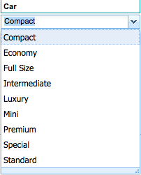
But sometimes it is not, and yesterday I ran across a perfect example. Consider the figure at right. This is a list of car sizes in the preferences area of a travel application. Does the list look logical to you? I can never remember whether “economy” is smaller than “compact” or vice versa; and what in the world is “special”? I submit that size is the logical order for a choice of sizes (duh!).

Similarly, sequence is the logical order for a choice of months or days of the week. (Would you suggest putting April first? I didn’t think so.)

The objective is to choose an order that helps people find the option they seek and (if they aren’t sure) to help them identify the right option. Ordering the car size list by size would do both.

Are you listening, Carlson Wagonlit?

posted by Elizabeth at 07:10 Tagged , , | 7 Comments

27 September 2009

So you’ve volunteered to review for the CHI 2010 UX Community

I’m delighted to say that, in addition to seasoned CHI-goers, I’ve recruited as CHI 2010 reviewers a number of strong UX practitioners who are new to CHI reviewing. Many of you have asked me what is involved in reviewing for CHI. Rather than answer you all individually, I am posting the information here.

Reviewing Process

The first round will involve reviewing papers and notes. Within a few days after 28 September, I will send each of you a few titles and ask you to tell me which ones you’d like to review. (You will receive titles targeted to the interests you’ve already communicated to me, to the extent that they match the titles I am asked to manage.) I need to get at least three reviews per paper, so if there are gaps or excessive overlaps in reviewers’ choices, we may have a wee bit of negotiating to do.

Once we have agreed which papers you’ll review, I’ll enter your choices into the CHI reviewer data base, which will take care of sending you the links to download submissions and enter your reviews. (It will also nag you about getting your reviews in. :-)

Reviews of papers and notes will be due to me by 5pm EDT on 25 October.

The CHI review process is described at http://www.chi2010.org/authors/chi-review-process.html.

Criteria

You’ll review submissions according to the guidelines provided by SIGCHI for the authors of submissions. The various types of papers and notes, and the criteria for each one, are described at http://www.chi2010.org/authors/selecting-contribution-type.html. (Although as of this writing I have not yet seen the papers I’ll be curating, I am confident that they do not include any theory papers. )

The most important criterion for CHI papers and notes is that they contribute new knowledge, techniques, or approaches to the field. For practitioner submissions, this often means using established techniques in new ways or in new contexts, or interpreting findings in new ways. It may mean devising a new way of making usability methods more effective or efficient.

Note: The criteria for other submission types are less focused on breaking new ground than are those for papers and notes.

Next Steps

After papers and notes, we will be reviewing submissions for panels and case studies. These are due on October 9, so I expect to have my assignments by about 20 October, which would make your reviews due to me by about 17 November. (I’m just guessing here, as I don’t yet know the exact dates.)

After that, we have alt.chi, SIGs, and works-in-progress. Those submissions are due on 4 January, so I’ll probably be farming them out starting about the 15th and expecting your reviews by about 10 February. Again, just a guess.

User Experience Community Chairs

  • Elizabeth Buie (Luminanze Consulting, LLC)
  • Susan Dray (Dray & Associates, Inc.)
  • Keith Instone (IBM)
  • Jhilmil Jain (HP Labs)
  • Gitte Lindgaard (Carleton University)

If you have signed up to review — or even if you are just thinking about it — please feel free to contact me with questions. You may email me at ebuie [at] luminanze [dot] com or use my Contact Us form.

posted by Elizabeth at 09:09 Tagged , , , , | Leave a comment

27 September 2009

CFP: CHI 2010 Workshop on Researcher-Practitioner Interaction

Workshop Overview

This workshop will bring together researchers and practitioners of human-computer interaction to explore whether and to what extent difficulties exist between them — and, if so, will endeavor to identify the dimensions of the problems and propose possible solutions. On the one hand, we will work to articulate factors that may render the research literature inaccessible or irrelevant to practitioners and to suggest potential improvements and approaches. On the other hand, we will also strive to learn from researchers how their research could benefit from practitioner input. We invite practitioners and researchers to submit a position statement of up to four pages, plus a short bio, by email to ebuie [at] luminanze [dot] com by 5pm EST on 6 January 2010 (note new date), to participate in this one-day workshop.

Your position paper should attempt to answer one or more of the following (or related) questions:

  • How can the usefulness of research papers be improved to suit varied audiences?
  • How should research be disseminated to different audiences, including practitioners?
  • What are the barriers that discourage practitioners from adopting research findings?
  • How can research papers be made more accessible to practitioners?
  • How can collaboration between the two subcommunities be enhanced, for future CHI conferences?
  • What should students of HCI and interaction design be taught about research, to prepare them for the practitioner world?

We will select a variety of viewpoints from participants with diverse experience. Participants will have access to all of the accepted position statements in advance, to facilitate pre-conference discussion and to support the formulation of discussion questions. The organizers will also publish a draft agenda to prepare for the in-depth discussions during the workshop.

Up-to-date information on the workshop will be available on this blog post, which can be reached directly at http://bit.ly/CFP-CHI2010-RPI

Please note that participants must register for the workshop and for at least one day of the CHI 2010 conference. Fees for a one-day workshop at CHI 2010 are estimated to be $175.

Important dates

  • Submission deadline – 6 January 2010 (note new date)
  • Notification – 30 January 2010 (note new date)
  • Workshop – Sunday, 11 April 2010 (contiguous with the main conference)

Organizers

Please feel free to contact any of the organizers with questions.

posted by Elizabeth at 01:09 Tagged , , , , | Leave a comment

15 September 2009

Submission to IxD10: Hone Your Surveys!

Title: Hone Your Surveys!

Abstract

Free your surveys from the biggest common flaws.

Most of us find ourselves inclined to conduct a survey at least once in a while. Although surveys cannot replace observation, interviews, or empirical usability testing, they can be a cost-effective adjunct to more direct user research if designed and used appropriately. Unfortunately, too many surveys have fundamental design flaws that practically guarantee that they will produce invalid or unreliable results.

This session will begin with a brief introduction to the basic principles of survey design, focusing on the four kinds of variables, the types of scales and questions, and the main sources of bias. We’ll spend the rest of the time in large- and small-group exercises and Q&A;, to give you practice at designing questions and at evaluating questions designed by others. Feel free to bring survey questions from your own experience. either ones you’ve designed yourself or ones you’ve encountered somewhere.

Note: A 40-minute session cannot possibly cover survey design in any real depth; that would take hours if not days. But it can provide the basics and alert you to the most common problems so you can keep your surveys free of them.

Biography

Elizabeth Buie is principal consultant at Luminanze Consulting, LLC. With more than 30 years’ experience in UX, she has done research, analysis, specification, design, development, and evaluation for web sites, web apps, desktop and mainframe apps, and complex systems such as spacecraft control centers.

Elizabeth has master’s degrees in mathematics and in human development — a nice mashup for the psychometrics courses required for the latter and a perfect combination for designing surveys. She has designed and analyzed surveys for clients such as the American Library Association, the US Department of Education, and the American Chemical Society.

Elizabeth co-chairs the CHI 2010 User Experience Community and serves on the editorial board of the UPA’s Journal of Usability Studies.

posted by Elizabeth at 10:09 Leave a comment

15 September 2009

Submission to IxD10: (Re)Designing Researcher-Practitioner Interaction

I’ve just submitted one of my two proposals to the Interaction ‘10 conference. Here’s what I submitted:

Title: (Re)Designing Researcher-Practitioner Interaction

Abstract

Do you wish you knew more about what research was available to help guide your interaction design decisions? Do you have the feeling that it’s out there but you aren’t sure where to find it or how to interpret and use it? Do you wish your design education had better prepared you for finding and making use of human interaction research?

Do you feel that research is just irrelevant to what you do?

The HCI community believes that a disconnect exists between research and practice. Over the past 30 years, research into the nature of such problems has been conducted in a variety of disciplines. Some of the studies report that research findings are often couched in jargon, are overly technical in an academic sense, and can be simply irrelevant to practitioners. Some studies attribute the problem to academics’ lack of familiarity with real-world problems and business realities or to the way these are tackled in the practitioner community; others have found that practitioners appreciate and recognize the value of theory-driven research provided its relevance is made clear to them. In their self-defense, researchers point out that aiming research to industry dilutes its academic value and that applied research has no rewards when it comes to salary and promotion.

A full-day workshop (working session) on researcher-practitioner interaction will be held during the CHI 2010 conference in April, where researchers and practitioners will come together in an effort to clarify the issues underlying the apparent misalignment between them and to define an approach to ameliorating it.

This IxD10 discussion will be led by one of the CHI workshop organizers, who will take your comments and feed them into the workshop discussion. Take this opportunity to contribute to the dialog and improve the utility of research to design practice. Make your voice heard.

Biography

Elizabeth Buie is principal consultant at Luminanze Consulting, LLC. With more than 30 years’ experience in UX, she has done research, analysis, specification, design, development, and evaluation for web sites, web apps, desktop and mainframe apps, and complex systems such as spacecraft control centers. Elizabeth’s interests span the researcher-practitioner divide: Although she has always worked as a practitioner, she has long been interested in research and has dabbled in it from time to time.

Elizabeth has master’s degrees in mathematics and in human development. She is a co-chair of the CHI 2010 User Experience Community and an organizer of the CHI 2010 workshop on Researcher-Practitioner Interaction. She also serves on the editorial board of the UPA’s Journal of Usability Studies.

posted by Elizabeth at 04:09 Leave a comment

8 August 2009

Serendipitous juxtapositions of tweets

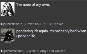
Every once in a while, two unrelated tweets appear next to each other in my Twitter stream and lead me to chortle or even guffaw at the accidental meaning that their juxtaposition creates. Here are some examples. (Note: The second tweet appears above the first.)

FaceFeatures

Now who would say that to a friend?

The objective

Never realized Alice was in on it, too.

Normality

Redesigning a site that won a design award doesn’t seem all that normal to me.

A life of one’s own

You certainly don’t, Alice; you’re fictional.

The oldest profession

Would that be Advertising, or Design?

Unpopularity

Must be something in what we’re feeding them.

The question answered

I told him he could go ahead. :-)

Positioning is everything

Oddly enough, he was sitting right on top of one.

Last updated 11 August 2009, 14:32 EDT

posted by Elizabeth at 12:08 Tagged , , | Leave a comment

31 July 2009

User Experience Tweeps

Note: This list has become too big for the blog, so I’ve moved it to the main site, under Resources. You’ll find it here: http://www.luminanze.com/resources/uxtweeps.html

posted by Elizabeth at 01:07 Tagged , , , , , , | 5 Comments

14 July 2009

Lorem Ipsum, Anguish Languish — or realistic text?

“Hoe-cake, murder,” resplendent Ladle Rat Rotten Hut, an tickle ladle basking an stuttered oft.

Today I tweeted* the above quote from my favorite playful work on the English language: “Ladle Rat Rotten Hut” , from Anguish Languish, the 1950s work by Howard L. Chace. That tweet generated brief Twitter conversations regarding the use of dummy text in draft/preliminary screen designs.

Many designers use what’s called Lorem Ipsum to populate their designs with placeholder text, to illustrate the intended appearance of text in the design without indicating what the content of that text might be. The text of Lorem Ipsum comes from a treatise on ethics, written by Cicero in 45 BC. Lorem Ipsum is, of course, in Latin, which is especially amusing because it is used as a method of doing what is commonly called “greeking” text.

So, I tweeted that sentence from Ladle Rat Rotten Hut, and @banjobunny hooted and said she “might start using this copy in my design comps in place of Lorem ipsum – see if they notice.” I loved the idea and said I just might do the same. Then @jddj said “boo-hiss” to the very idea, commenting that “its presence always tells me I didn’t think through what kind of content should be there.”

But is that true? No, I don’t think so.

Here are the issues I see:

  • Stage of design. Sometimes (in my experience, often) you have to produce wireframes, or draft layouts, before you’ve nailed down the contents, and you want them to look somewhat realistic so you can look at the Gestalt to help you determine whether you’re on the right track. This requires having some amount of texty-looking stuff, and dummy text is the fastest way to include it.
  • Level of review. Sometimes you have to present your drafts to your client and/or to users, just to evaluate the layout without letting the content get in the way. It’s much easier to do that with text that’s obviously fake than it is to keep telling them “Ignore what it actually says; this is just an example.”
  • Generality of review. Some web sites are designed for organizations in which different groups will be responsible for creating and maintaining the contents of different parts of the site. If you use a sample of real text, you may find that one or more groups to which the content does not belong may (a) feel slighted or (b) object that the layout does not pertain to them because they have specific needs that the content area you’ve chosen does not meet. Using neutral non-content allows all groups to assess the potential of the text areas to contain their content.

Clearly, if you’re assessing a web site’s information structure or its navigation, you’ll need to use real content. How else are you going to know whether users understand it?

But under certain circumstances I see clear advantages to using dummy text. If its copyright is not an issue, next time I need to “greek” a design I may just use Anguish Language.


*“Tweeting” is posting a short comment (140 characters or fewer) on the Twitter microblogging service. You can find me on Twitter at @ebuie .

posted by Elizabeth at 06:07 Tagged , , , , , , | 1 Comment

29 June 2009

My funniest moment in usability testing

As a consultant in interaction design and usability assessment, I conduct a fair amount of usability testing . The kind of testing I do generally involves preparing test scenarios in advance, because my clients and I want to make sure we test the aspects of greatest interest and concern, and that we test them the same way with multiple participants.

So I was testing a web site that allowed users to make travel reservations. In exploring the site to tease out major issues, I noticed that it didn’t handle cities very well by name; it seemed much more comfortable with airport codes. So I chose to have participants make a reservation to Lincoln, Nebraska, figuring that they might guess LIN as the airport code — and end up in Milan, Italy. (Lincoln’s code is LNK; LIN stands for Milan’s Linate Airport.)

Most of the participants in the test had at least some trouble with booking a trip to Lincoln, and more than one actually did wind up with a reservation to Milan. When one of these people realized what had happened, she howled with glee, then turned to me and demanded, “You did that on purpose, didn’t you? You knew that would happen!” (At this point I was free to laugh too, and I had to admit that I had.)

That’s my funniest moment in usability testing. What’s yours?

posted by Elizabeth at 05:06 Tagged , | Leave a comment