27 June 2009

The Unbearable Rightness of Catastrophizing

Most people think of catastrophizing as a way of thinking that healthy people avoid. The online dictionaries agree. Wiktionary, for example, defines the act as “to regard a bad situation as if it were disastrous or catastrophic”; Go-Dictionary has it as “to envisage a situation as being worse than it is”. Clearly they’re seeing it as an unrealistically negative way of looking at events or circumstances. Perhaps it’s even a sign of mental health problems.

Psychologists go even further. According to PsychCentral, catastrophizing comes in a second form as well:

The second kind of Catastrophizing … occurs when we look to the future and anticipate all the things that are going to go wrong. We then create a reality around those thoughts (e.g. “It’s bound to all go wrong for me…”). Because we believe something will go wrong, we make it go wrong. [emphasis mine]

Yikes! But does it have to be that bad?

I say no. Not if we do it on purpose.

People who do usability assessment are accustomed to catastrophizing. When we conduct a usability review, we look for possible sources of confusion and error, so that designers can devise changes to mitigate them. However, this process need not be limited to post hoc review — nor should it; I recommend that designers do it regularly during design.

Design, of course, doesn’t need to catastrophize to the extent that assessment does — that is not its main function; and overdoing it can hamper creativity the way overediting does to writing. But I argue that a little attention paid to potential problems, during design, can go a very long way. Let me give an example.

On one of my projects — creating the interaction/interface design for a client, for another organization to build — I am the HCI specialist and my teammate is the prototyper, and we collaborate on creating the design. Very energetic and creative he is, up on all the latest interaction techniques and enthusiastic about their possibilities. More conservative about whiz-bang techniques I am, more grounded in decades of HF and HCI research findings. He enriches the design immeasurably; I keep it connected to the why. One of us proposes an idea, I catastrophize it, and we jointly come up with a way to address the problems. We both find our design sessions enjoyable and sometimes frustrating, but they produce a design that’s far better than anything either of us could do independently.

The client absolutely loves our work.

Now, I do not mean to imply that designers never consider the problems their designs might cause users. Many do; and of course the best ones do it very well. Some people, including David Malouf, professor of interaction design at the Savannah College of Art and Design, would even argue that Design as a process naturally includes such examination. I think I would agree with them. However, we all know that many if not most digital products are produced without a conscious design process along the lines that Dave teaches, let alone usability assessment. Whether or not a project has time and resources for formal usability assessment, a little catastrophizing during design can make a big difference.

If we aim to design products for the best user experiences, we must imagine the possible errors and problems that our designs might induce. This does not mean that (in the words of the psychologists) “we make it go wrong” (emphasis mine). Our looking for the possibilities has an entirely different effect, because it has an entirely different purpose, and we are doing it consciously and intentionally. Only by knowing what the potential problems are, can we prevent them. We must “look to the future and anticipate all the things that [could] go wrong.”

We must catastrophize, I say. We must catastrophize.

posted by Elizabeth at 01:06 Tagged , , , , | 1 Comment

12 June 2009

Sharing your photos without losing control of them

I received my first camera for Christmas at age 12, got serious about photography at 24, and went digital in 2002. I’ve had a stock photography web site for over ten years, but it has turned out to be more a labor of love than of profit making. And with all the photo sharing going on these days, I finally decided it was time to let go somewhat, change my model, and start posting my work where it could more easily be seen — and, yes, used.

“Used.” That part gave me pause, I have to admit. I didn’t want my work used commercially or in such a way that my hand in it would be invisible or I’d lose ownership of it. On the other hand, with so many free images out there, available for noncommercial use, it had begun to seem pointless to decline to join in.

I did some research, tried out a couple of services, and asked people about their experiences. Below are the decisions I made. I hope they will be helpful to you as well.

Creative Commons License: Attribution, Noncommercial, No Derivatives

I selected the most restrictive Creative Commons license available. Creative Commons is an approach to licensing intellectual property while retaining copyright and some amount of control over how it is used. Here’s how the organization puts it:

With a Creative Commons license, you keep your copyright but allow people to copy and distribute your work provided they give you credit — and only on the conditions you specify here. (http://creativecommons.org/license/)

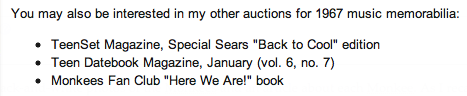
In this way I allow people to use my photos for noncommercial purposes only, and I do not permit them to make derivative works. And of course they must give me credit whenever they use my work. I’d like them to link back to my Flickr site as well, but I don’t see any way to insist on that.

Now, this license applies to free use only. Anyone who wants to use my work for commercial purposes, make derivative works from it, or use a larger/higher-quality image is more than welcome to contact me about licensing such usage. For a fee, of course. :-)

Image Size, Quality: Small to Medium, Low to Medium

I upload low- to medium-quality JPEG images that are no larger than 600px in either dimension. This is perfectly sufficient for blogs and other noncommercial uses, but the resolution and image quality are inadequate for many if not most commercial uses. This strikes me as a reasonable balance between sharing and protection.

Service: Flickr

I created accounts with both Flickr and Google’s Picasa and tried them out. It didn’t take long at all (under an hour, in fact) for Flickr to emerge as the clear winner: Not only does Picasa fail to offer the restrictive Creative Commons Licenses, but its mapping interface (how you tell it where the photo was taken) is dreadful.

Note that Flickr’s free service imposes fairly low limits on what you can upload per month, but the kicker is that only your 200 most recently uploaded images will be displayed to people who visit your Flickr photostream. So I sprung for the US$24.95/year pro service. For me it was a small price to pay for removing the 200-image display limit.

Here’s my Flickr photostream.

Tagging: Full

I provide fairly complete tags for each image. So far the titles are not detailed (that is, many images have the same title, but for those that show the same subject — e.g., St. Peter’s Basilica in Rome — that’s probably OK. And as yet I have not put up many descriptions. I plan to go back and add detail later, but my first priority was to upload as much as possible, as soon as I could.

Also important was geotagging, or indicating on a map where the photo was taken. This helps people find your photos when they are searching for images of specific places. For some reason, Picasa doesn’t use the full detail of Google Maps, and its maps are less detailed than Flickr’s. But Flickr’s, in turn, are less detailed than the normal Google Maps, so I use both. I use Google Maps to zoom in on the specific spot I want to tag, and then I match the spot on the Flickr map and drag the images there. It’s a bit more work than I’d like, but I enjoy reading maps and am good at it, so for me it’s not onerous work at all. (Your mileage may vary.)

Organization: Sets and Collections

Flickr allows you to organize your work into collections and sets. I have (so far) four collections, each of which consists of 3-6 subgroups. Subject areas that are richer (e.g., Italy and the UK) are more than two levels deep.

Here are my collections.

Discovering Uses of My Work: Addict-o-matic™ and TinEye

It would be nice if people who used your work would be courteous enough to let you know about it. From what I understand, sometimes they do. But even if most of them did so, you’d still need to look for cases where they didn’t. Just in case. So you search for your name, assuming that people are honoring the attribution part of the CC license and listing your name as the author of the image.

I use a service called Addict-o-matic™ to perform this search. I could simply Google my name, but the nice thing about Addict-o-matic is that it uses several search engines to produce different areas of its results page, so that you can both be confident of greater coverage and see the references in cohesive groups.

Here’s my Addict-o-matic page, and here’s the first blog post to use one of my photos from Flickr.

I have also just started looking into the TinEye image search. You upload an image or give it a URL, and it searches for other uses of that image (and similar ones) on the Web. TinEye didn’t find that blog’s use of my Tintern Abbey photo because its data base of indexed images is still very small — but I think it looks very promising.


Acknowledgments

I am especially grateful to Ed Yourdon for starting me off by sharing his own approach. Ed’s been doing the Flickr thing a good while longer than I have, and I appreciate his generosity with information and suggestions.

posted by Elizabeth at 07:06 Tagged , , , , | Leave a comment

15 May 2009

In praise of online communities

How many online communities do you participate in? I have trouble counting mine, separating the technology or service (Facebook, Twitter, LinkedIn, email servers) from the communities that come together via those services. But no matter how I look at it, I count mine about a dozen. Some are personal, some are professional, and some (mainly Twitter and Facebook) are a mix. They vary in their importance and durability in my life. Some have been with me for ages (the longest lasting being more than 15 years); others are very recent. Some have come and gone.

If you asked me which community is the most important to me right now, I’d be hard pressed to answer. But if you asked me which one was the most important throughout my years of participation, my answer is clear.

The Circle (new window) is an online support group for people who love someone with prostate cancer, and for the men themselves. I found The Circle after my husband’s hormone therapy had stopped working, and I was searching the Web for resources and information. For almost four years the other Circlers and I shared information, support, and hope; and for the last six months of Antonio’s life I emailed them almost every day, sometimes several times a day. Even during the two weeks when I lived in his hospital room, I always took time during my occasional brief visits home to update them on how he was doing and how I was handling it. They were my online family, and they understood.

I shared our journey because doing so was keeping me sane… Yet it turns out that my sharing was a two-way street. After Antonio died, I received many emails letting me know how much meaning these people had found in reading our story — even people with whom I had hardly corresponded at all.

The mail from women struck a special chord. “Sometimes I dread reading your posts,” wrote one, “because I know that one day I will be traveling the same path, and it scares me tremendously. But seeing you walk that path gives me hope, because now I know that it can be done.”

And here I was, thinking they were keeping me sane. But their messages told me that I was giving to them equally… and that deepened our connection and facilitated my healing.

Antonio died in the spring of 2001, more than eight years ago (I write this post on our wedding anniversary), and I stayed with the Circle about a year afterward. Prostate cancer is no longer a part of my everyday life, and I don’t need that support any more. But that doesn’t change its importance for me, nor does it lessen the fondness with which I remember the friends I made there.

Would I have managed without this support group? Maybe. Probably. Would I have managed as well? Absolutely not. Without a doubt, the Circle has been the most meaningful online community in my life so far.

Part of this post was taken from a talk I gave in 2006 to my congregation. You can read the whole thing (new window) on my congregation’s web site (scroll down to see my talk; I was last).

posted by Elizabeth at 05:05 Tagged , , , | Leave a comment

7 May 2009

Help eBay buyers find your other auctions

Do you sell on eBay? Do you ever put up two or more related items at the same time? If so, consider linking your items to each other. This will make it easier for buyers to find all of your items — much easier for them than clicking “View seller’s other items” when they have no idea what your other items might be. (Note: You have to do it immediately after you start your auctions, and the technique requires some knowledge of HTML.)

Last night I put up four items, in separate auctions. I use GarageSale, a Macintosh application for eBay, to prepare my auctions off line. When these four were ready, I uploaded them all within a few minutes of each other. Then I linked each of them to the other three. Here’s what one of them looks like:

(The yellow box is just to highlight the area of interest, of course.)

Here’s how to do it:

1. Create in each auction an unordered list that includes the titles of each of the other three auctions. It’ll have to be just a plain-text list at first, because you don’t know yet what the URLs are going to be on eBay. Here’s how that looks in my example:

2. When all four auctions are up on eBay, open each one in its own browser tab, to make the eBay URLs easily available. Here’s what that looks like:

3. For each one, click the “Revise your item” link, which appears at the top of listings that have no bids yet. Once an item has a bid, you can no longer revise it, which is why this has to be done immediately after you start the auction.

4. In the “Revise Item page, scroll halfway down until you see “Describe the item you’re selling”. Initially, this will show the “Standard” view, the graphic view as it appears in your auction, and you will need to switch to the HTML view.

5. Click on the “HTML” tab here, and scroll that area down until you see the code for the list of related items. Around each title paste the tag with the appropriate URL for that auction, which you will get from the other tabs in your browser window.

Here’s what mine looked like when I had finished pasting in the URLs:

6. Then click “Continue” at the bottom of this page and “Submit changes” at the bottom of the next page, and you’ve linked this auction with the others!

You’ll need to repeat this process for each of your other related auctions, but once you become familiar with it, it doesn’t take long.

I can’t guarantee that linking your auctions will increase your sales, but it may well make things easier for you. A couple of months ago I sold six lots of 35mm film that I had decided I wasn’t going to use any more, and the same person bought four of them. It saved him money on shipping, and it saved me time and effort on both packing and shipping. It was a win for both of us.

P.S. Yes, I admit it — in 1967 I was a Monkees fan.

posted by Elizabeth at 04:05 Tagged , | Leave a comment

23 April 2009

Don’t ask why

Or,
Everything I know about guiding conversations I learned from psychotherapy

Conversations play a critical role throughout user-centered design, from requirements elicitation to usability test debriefing to issue resolution. And when our objective is to be objective — to avoid biasing the information we collect and the responses we receive — it behooves us to pay close attention to how our words affect those with whom we are conversing. Herewith, three words to avoid: why, but and can’t.

Why

Think about the last time you asked someone for something and they asked you why you wanted it. How did you feel?

Although asking “why?” is usually intended to elicit the underlying reasons, it often comes across to the listener as a challenge, implying that something is not quite right about the request or the action. This question often creates defensiveness, which can make it harder for us to obtain the information we want. So here are some alternatives:

For an action taken:

  • “What led you to do…?”
  • “What was your purpose in…?”
  • “How did you come to…?”

For a design feature requested:

  • “What objective are you trying to reach?”
  • “What would it help you do?”
  • “How did that idea come to you?”
But

Think about a time when you’ve asked for something and your listener has started his or her response with “but…”. Doesn’t that diminish the value of your request just a little?

“But” (as does “however”) creates a false or exaggerated contradiction or dichotomy. It discounts the importance of what came before. Here are some alternatives to consider:

  • “and”
  • “still”
  • “yet” (maybe!)

The only alternative that I really like, though, is “and”.

Can’t

Think back again to a time you asked for something that was important to you and your listener started with “We can’t do that.”

“Can’t” gives the impression that the client/user has made a wrong request. It gives the discussion a negative tone, even adversarial. Here are some alternatives:

  • “That’s an interesting idea. Tell me more.”
  • “Here’s what we can do…”
Others

Have you noticed any other words or expressions that tend to produce resistance when someone uses them in talking with you? What problems do you think they might create in an interview? What might be some alternatives?

And how come I am writing about this?

Well, you know, they say we teach what we most need to learn…
And I find that I need to keep reminding myself of it, every time I work with a client or a development team.

posted by Elizabeth at 11:04 Tagged , , , | Leave a comment

24 March 2009

The personality of a blog

I’ve just read Rachael King’s article in BusinessWeek called “What Your Blog Says About You” . Rather than describe Typealyzer myself, I’ll quote from King’s article:

Typealyzer is a research project that looks at how language reflects a person’s psychological type and his or her motivations and interests. The site was created by Mattias Östmar of PRfekt, a Swedish research and development company focused on media analysis.

For the past two years, Östmar has been collecting sample texts from blogs, based on research about personality type and writing style. The site uses a tool to run a statistical analysis of the text to come up with a word frequency algorithm for different personality types. After the blog is scanned, Typealyzer comes up with personality types derived from the Myers-Briggs model for looking at how people perceive the world and make decisions.

I’m familiar with the Myers-Briggs. In fact, I am qualified to administer and interpret it, and I’ve written about it. (See, for example, my article “Type and System Development: What’s the Connection?” , which is on my personal site and was published in System Development.)

So I ran the Luminanze Blog through Typealyzer, and it says I’m an INTP. Hmmm…

That’s pretty close, actually. Pretty dadgum close. But it’s not quite right: I’m an INFP . I do have strong T skills, though (having always been interested in math and science), and my profession allows me to blend technology and humanism. I’m in technology because I find its workings and possibilities interesting; I’m in usability because it allows me to find deeper meaning in my work, knowing that I’m helping make people’s lives easier. That’s classic NF stuff. But I think my writing reflects pretty well who I am, especially considering that I’m blogging about my professional field and not my personal life. I’ll give Typealyzer the benefit of the doubt and award it an A-minus.

I’ve run Typealyzer by a dozen or so INFP friends, and most of them say that it gets them wrong, sometimes very wrong. One thinks it’s because they aren’t blogging about their deepest selves. She may be right — and it makes sense to me — but without knowing how Typealyzer works I really can’t say.

King asks people to let her know whether their blogs match their personality types. Here’s what I wrote:

Mine was very close. From my blog (http://www.luminanze.com/blog), Typealyzer classified me as an INTP — and I am an INFP… with strong T skills. I’d say that my writing reflects pretty well who I am, and I give Typealyzer an A-minus.

I would find it very interesting to see a study of a large number of blogs in many fields, with the aim of teasing out the factors that can contribute to the discrepancies found.

To Jim Profit’s comment (“of course it fits, because no matter what sign you are the predictions are so vague they always fit”) — Jim, that’s just not so. Type is not about predicting the future, it’s about describing how a person relates to the world. I find commonality with more than one description — INFP and INTP, in particular (and to a lesser extent INFJ) — but in no way, shape, or form do I find that the ESTJ profile (just to take one example) describes anything remotely close to who I am.

So, about that study…

Here’s what I’d like to see:

Large number of blogs. Depends on the number of hypotheses tested (see below), but I would expect it to need at least ten blogs in each field. Maybe twenty.

Representative sample. This is going to be very hard to achieve. It can’t be done by broadcasting a request asking for volunteers. Self selection is one of the worst ways to recruit a sample that truly represents the population of interest, especially when you’re addressing issues of personality. (Some personalities are more likely to volunteer, eh?) So recruitment would need to be done by invitation. Perhaps the blogs could be submitted to Typealyzer and then the authors would be invited to take the Myers-Briggs (or related online questionnaire, although AFAIK none of those have been validated — I mean, we’re talking about a valid study here). However, the researchers would have to refrain from looking at the Typealyzer results before issuing the invitations.

Many fields. Not being an expert on the blogosphere, I can’t say off the top of my head how many fields the study should include, or which ones. I can only say right now that its designers would need to analyze the blogosphere and construct a categorization scheme that itself is representative of the blogosphere.

Teasing out the factors. This is all about hypothesis development. Can’t really be specified in a short blog post, without substantial analysis a priori. But I would expect it to include questions that would get at the four Ps: whether the blog was personal, professional, political, or playful.

Data collection. Just an online survey, I think. Except for the type inventory.

Whew, that’s a tall order!

Anyone up for collaborating?

posted by Elizabeth at 07:03 Tagged , , , , | 2 Comments

24 March 2009

Susan Dray: A portrait for Ada Lovelace Day

A few months ago I made a pledge to participate in Ada Lovelace Day . This project asks bloggers to dedicate March 24 to blogging about women who excel in technology, to help provide girls and young women with role models in a variety of technological fields. I honor Ada Lovelace Day today by writing about Susan Dray.

Dr. Susan Dray is an international consultant on human-computer interaction design and usability. She has contributed tremendously to the profession of human-computer interaction throughout her 30-year career in the field, beginning with managing a human factors department and then pioneering the development of usability labs in corporations outside the computing industry. In recent years she has been instrumental in spreading the use of cross-cultural and ethnographic user research throughout the developing world. She works tirelessly to facilitate the appropriate design and use of technology in cultures where it can make a profound difference in their lives.

Susan Dray really does it bright. Although I have been in the field just a few years less than she has, Susan has been a role model for me — not only as a professional, but also as a human being. She inspires me to reach beyond what I already know I can do, to stretch myself, and to care even more deeply about how my work helps improve people’s lives.

I met Susan in 1983, during my first time at a conference of the Human Factors Society (now called the Human Factors and Ergonomics Society ). She was co-leading a workshop on how to deal with being the only human factors person on a project, and as someone new to the field, not only did I find her knowledge and experience enlightening, but her energy and warmth encouraged me to persist with it; and I went on to get a second master’s, in a discipline related to the field. Our paths have crossed frequently over the years, and right now we are working more closely together than ever, co-chairing the User Experience Community at next month’s CHI 2009 , the annual conference of the Association for Computing Machinery’s Special Interest Group on Computer and Human Interaction. The last time I saw Susan, at CHI 2008, she had just finished leading a workshop on “HCI for Community and International Development” and was handing out pairs of socks left over from the workshop.

Socks?

Yep, socks. Socks with hearts on them.

“Anyone can wear their heart on their sleeve,” Susan explained. “But to make a real difference, to go in the right direction, we have to wear them on our feet as well.”

I took the purple ones.

posted by Elizabeth at 12:03 Tagged , , , , | Leave a comment

20 March 2009

Hold the elevator!

Go to a conference on human factors or human-computer interaction, and I bet you’ll find that the most common elevator topic is the design of the button panel in the conference hotel’s elevators.

The Web is full of thoughts on elevator buttons. A Google search on the phrase “elevator buttons” returns “about 49,000″ hits. Although some are photos, many are thoughts or conversations on how to improve the design.

I have a specific concern, and an idea for addressing it. Others have expressed my concern, but I have never seen my idea described anywhere. Pardon me while I ramble a little…

Unless you are a total stranger to elevators (hard to imagine, since you’re reading a blog), you’ve doubtless had the experience of being in an elevator whose doors were about to close, and hearing someone in the hallway shout, “Hold the elevator!”

You fumble at the panel. Which one is the dadblasted “door open” button?! By the time you’ve figured it out, the doors have closed. (I’ve taken to waving my arm between the doors to trip the electric eye. I did it with my leg on the Orlando Airport shuttle-train once, and impressed an elderly couple who were clearly more intimidated by technology than I am. )

I’ve found a few sites that mention the problem. I have yet to find one that has the solution I favor. Let me mention a few ideas, and then I’ll get to my own.

A guy named Dave has a “million-dollar idea ” to approach this problem — he revises the pictures on the door-open and door-close buttons.

John Bartholdi, of Georgia Tech, has a page on elevator button panels . He discusses many of the good and bad features of these panels, but he doesn’t mention my perfect idea.

Geof Huth blogs about the pictures on the open and close buttons and raises a very valid issue: Do they indicate the movement of the doors or the current state? “The problem I perceive,” he writes, “is that the ‘close door’ symbol looks open to me.” (It does to me too.) Several people have commented on Geof’s post, but no one has mentioned my very simple idea.

You get the picture.

So what would solve the problem and help you hold that elevator for your colleague or fellow traveler? Simple — make the “door open” button larger than the others! That way you wouldn’t have to peer closely at the open and close buttons to identify which was which; you wouldn’t have to decipher the symbols; you wouldn’t have to think much at all. You’d just push and hold the button that grabbed your attention.

So I’ve taken to promoting this idea every time I have to hold the elevator for someone. Everyone agrees that it’s a good idea. (Or maybe they’re just being nice. Who can tell in an elevator?) I wonder how long it’ll take before it catches on. (Maybe I should write ISO… hahaha.)

I did once encounter a guy who told me of the time he needed a quick-find door close button. He was riding up to his office, minding his own business, when two cops entered the elevator behind him, guns drawn, and jumped off at the third floor. He had never before, he told me, wanted so badly to see those doors close ASAP!

I submit, however, that the cops should have thrown him out of the elevator before going in search of their crook.

Anyhow, here are a couple of drawings I dashed off in PowerPoint. Nothing fancy, and the arrangement may not be perfect. Perhaps the “door open” button doesn’t need to be as much larger as I’ve shown it. But I think you can see how it makes the critical button easy to find and press in a hurry.

elevator buttons as they're usually seen
Elevator buttons
as they’re usually seen
elevator buttons with a large 'door open' button
Elevator buttons
with a large “door open” button

Larry King has recently posted a picture of a larger door-open button . It doesn’t satisfy me completely, but it’s a start.

posted by Elizabeth at 10:03 Tagged , , , | Leave a comment